Research
|
Creative Strategy
|
Concept Development
|
Visual Storytelling
|
Art Direction
|
Logo & Naming
|
Updated Brand Identity
|
Product & Packaging Design
|
Type Manipulation
|
Illustration
|
Pattern Design
|
Spatial Design
|
Event Branding
|
Copywriting
|
Advertising
|
Web Design
|
Collateral Design
Research | Creative Strategy | Concept Development | Visual Storytelling | Art Direction | Logo & Naming | Updated Brand Identity | Product & Packaging Design | Type Manipulation | Illustration | Pattern Design | Spatial Design | Event Branding | Copywriting | Advertising | Web Design | Collateral Design
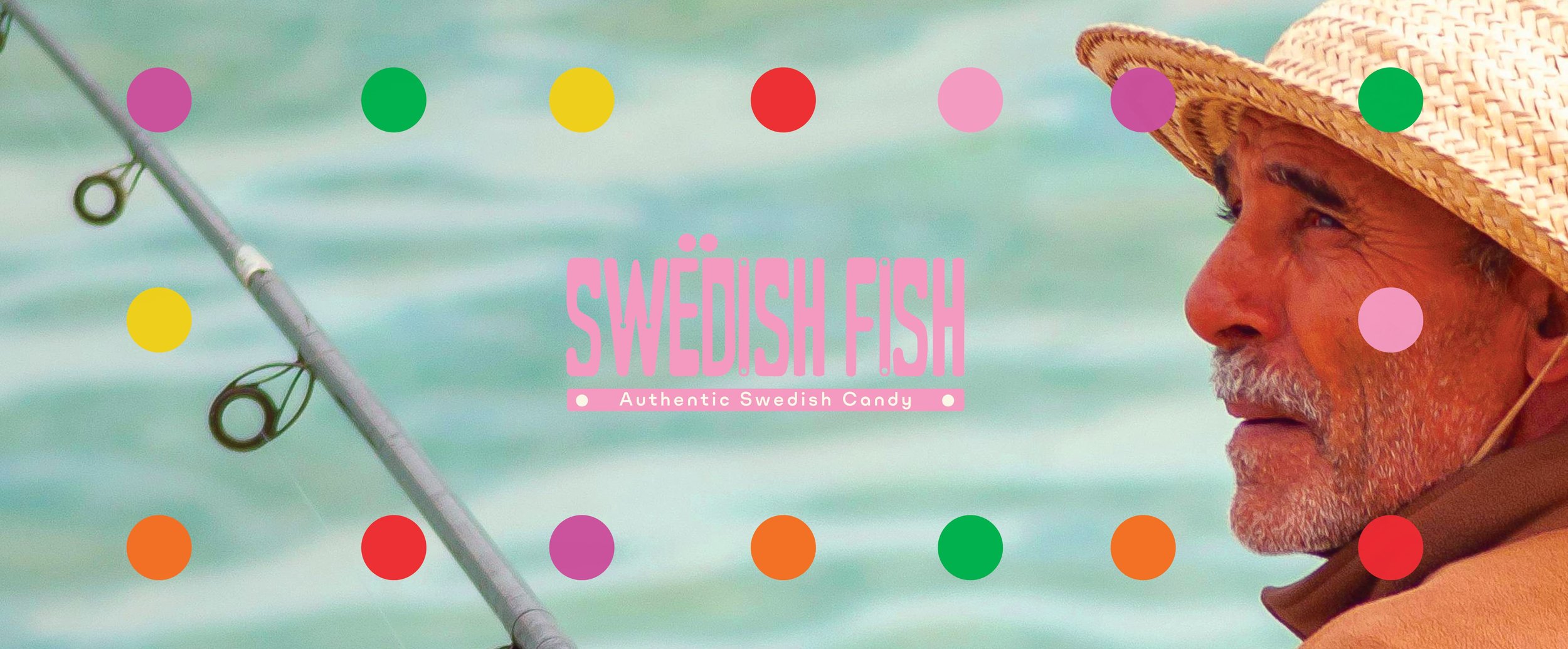
The Idea
As someone with a huge sweet tooth I am often in the candy aisle of the grocery store. However, I have recently avoided eating any foods that use Red 40 dye, which includes one of my favorite candies of all time, Swedish Fish.
I had an epiphany, what if Swedish Fish got a brand re-fresh? Not only did the candy need improved ingredients, I noticed the packaging could really use a re-design as well.
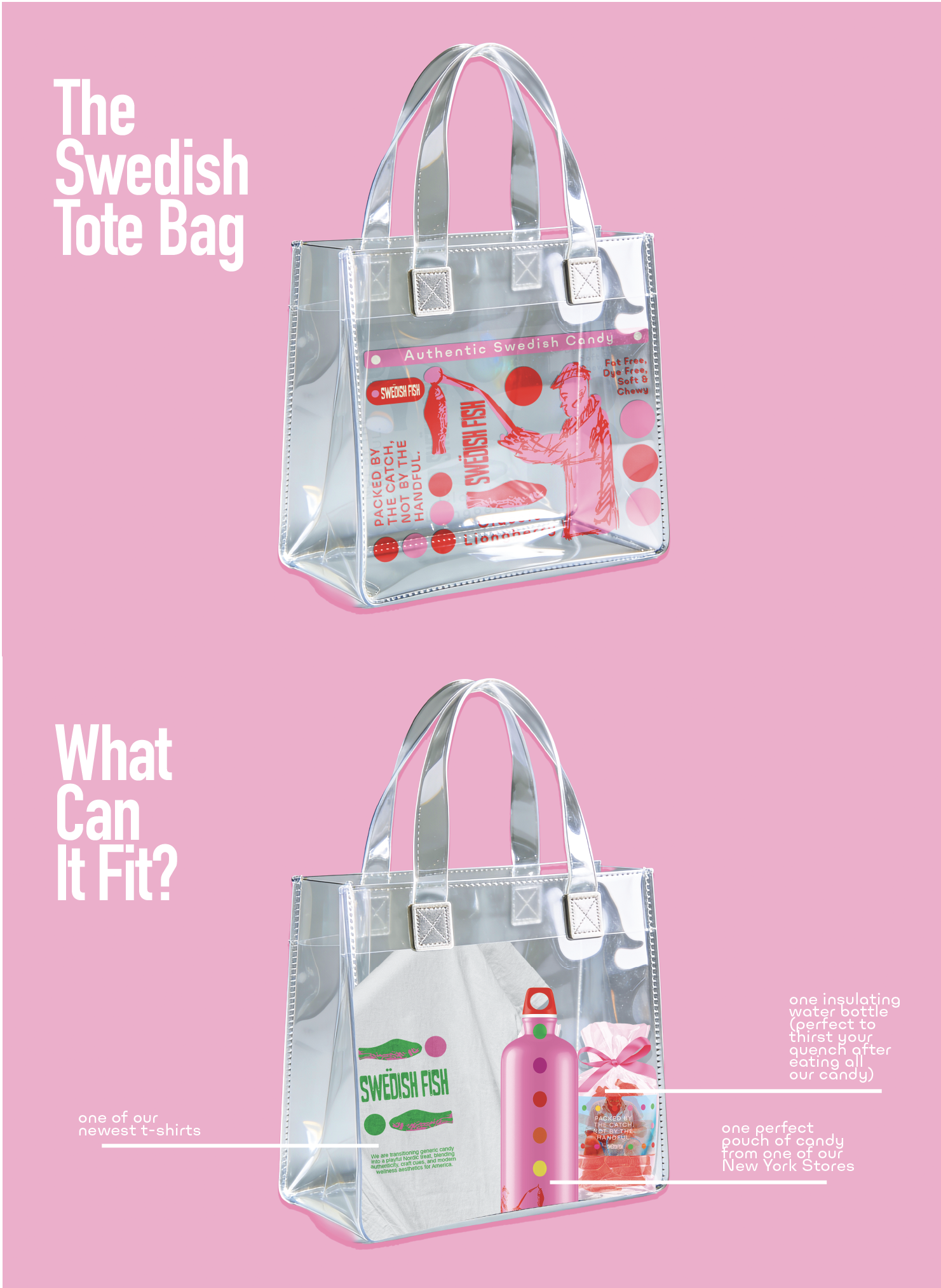
Enter Manoco. Now part of the Swedish candy company Cloetta, Manaco is here to finish what they started and reclaim Swedish Fish! The new branding reconnects the candy to its original intent: celebrating Sweden’s fishing heritage. This transforms Swedish Fish into a culturally authentic, delicious, and playful treat, giving it the rebrand it deserves.
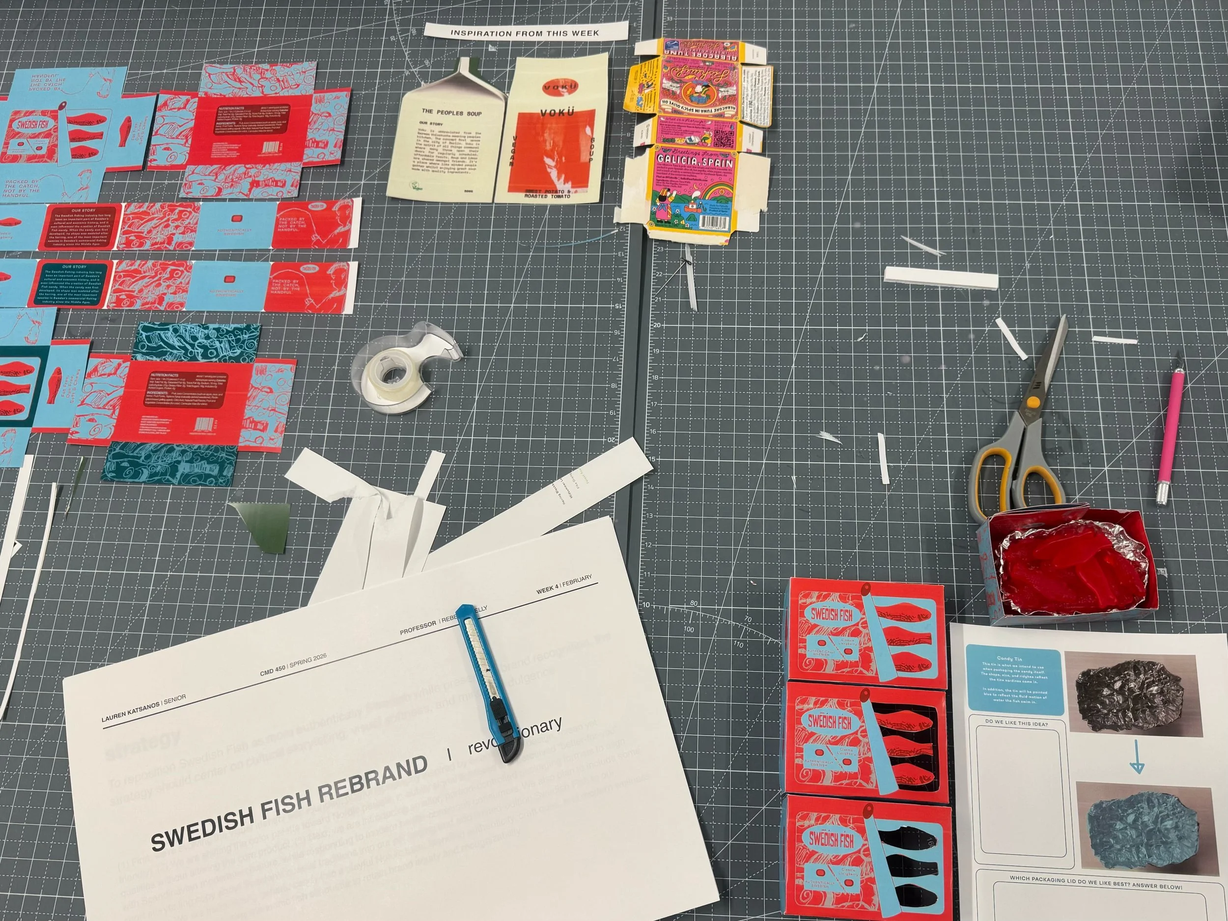
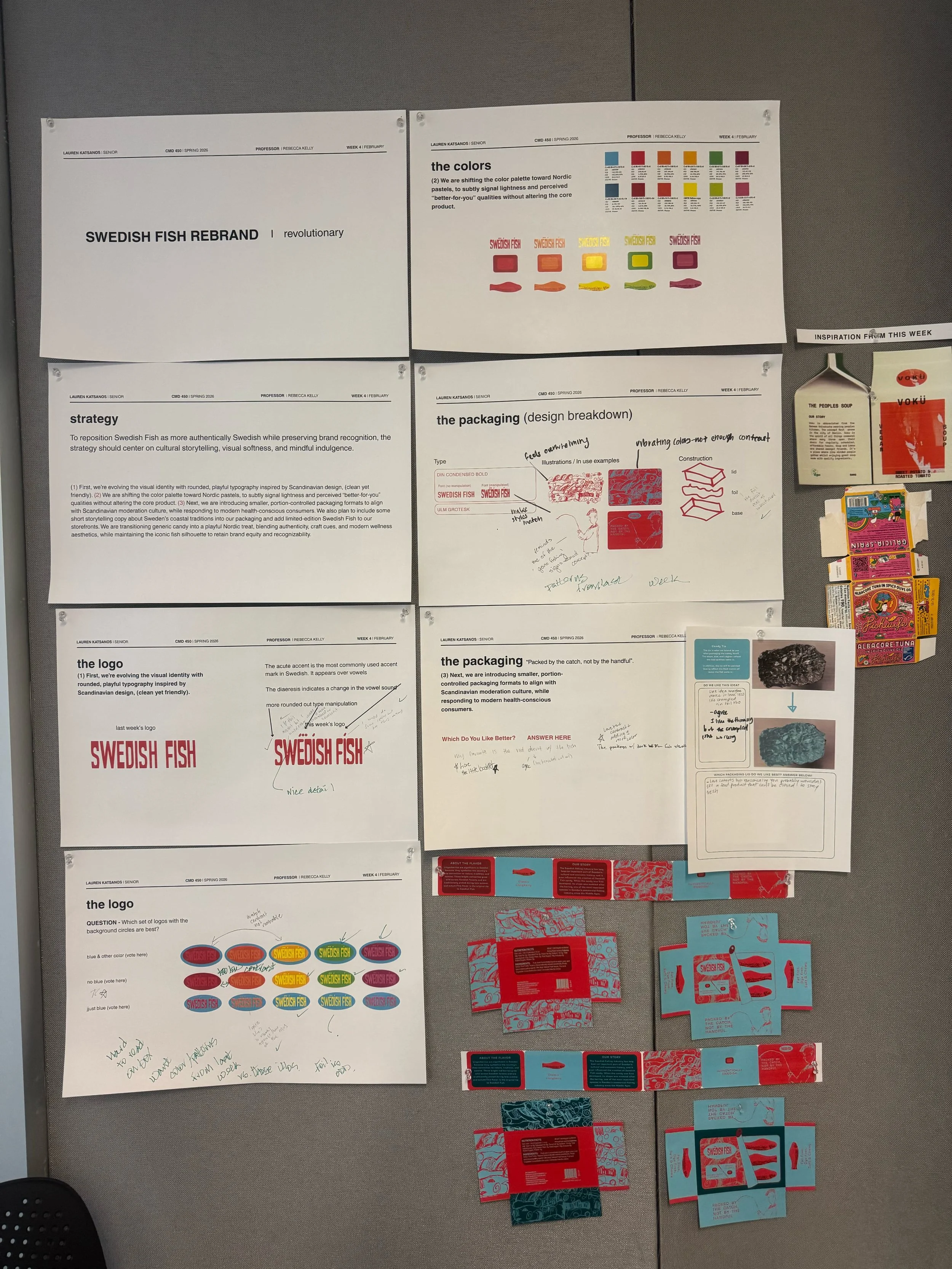
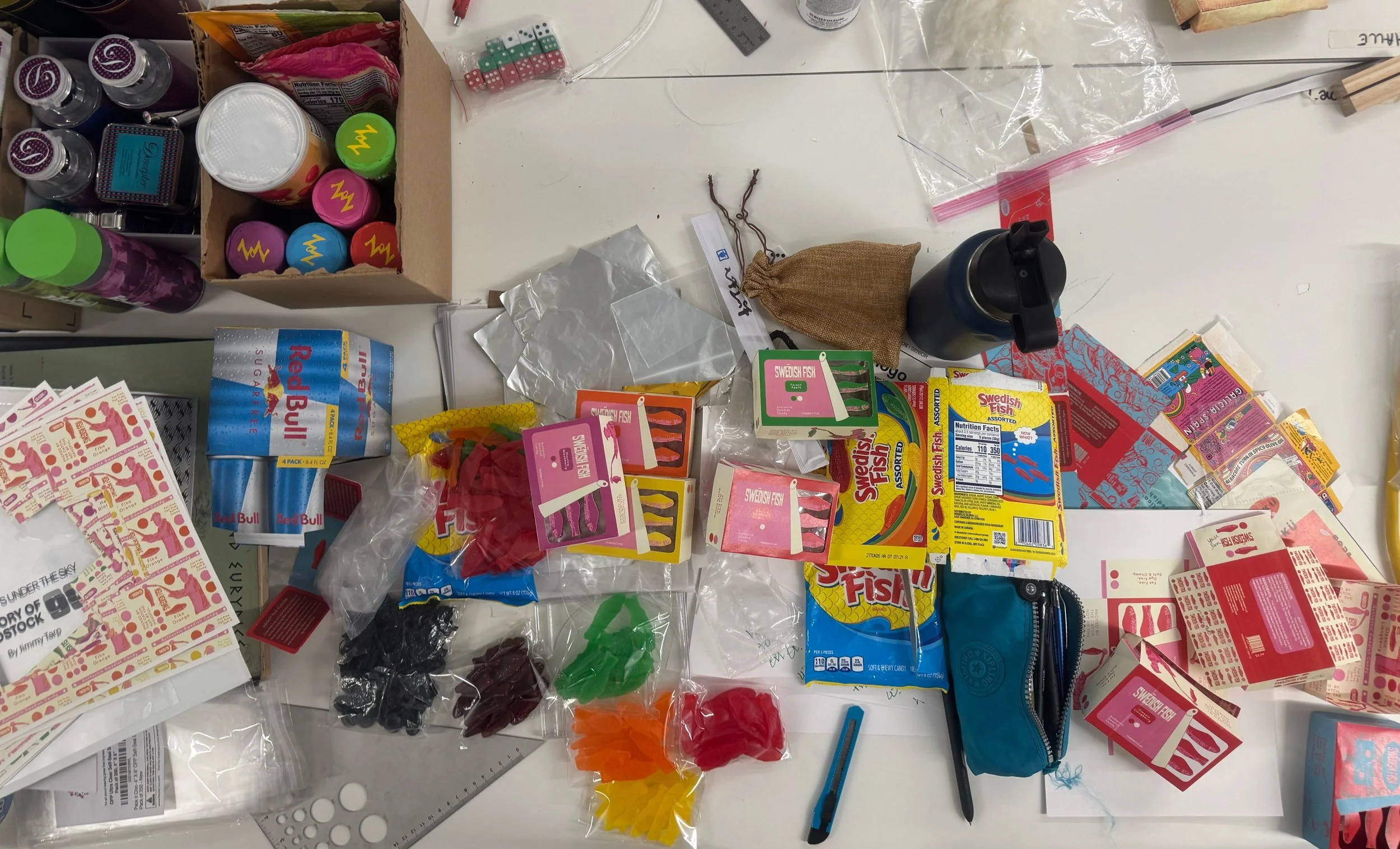
The Build
The process began with research into the origins of Swedish Fish and how the brand has evolved. By exploring authentic Swedish and Scandinavian design, inspiration was discovered to guide the project.
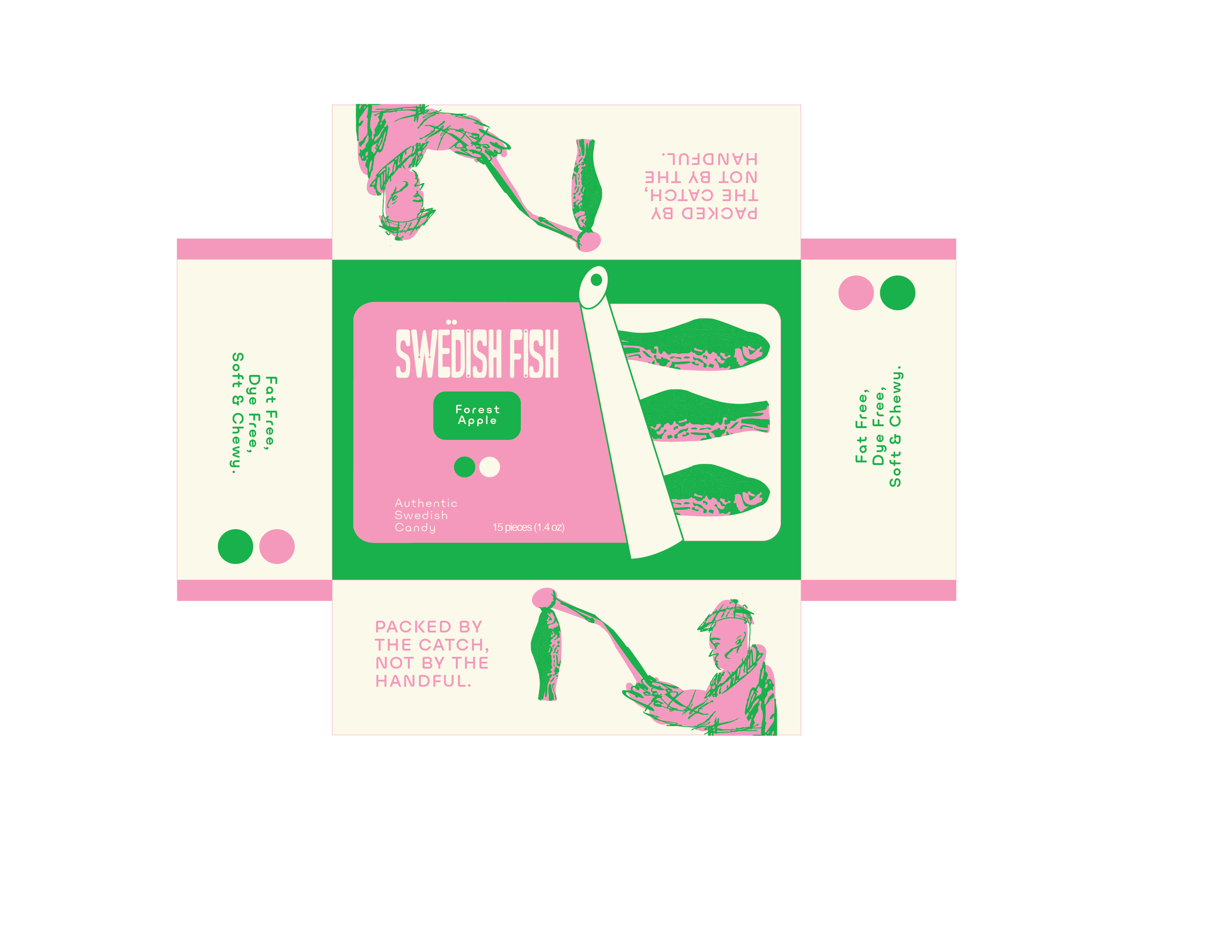
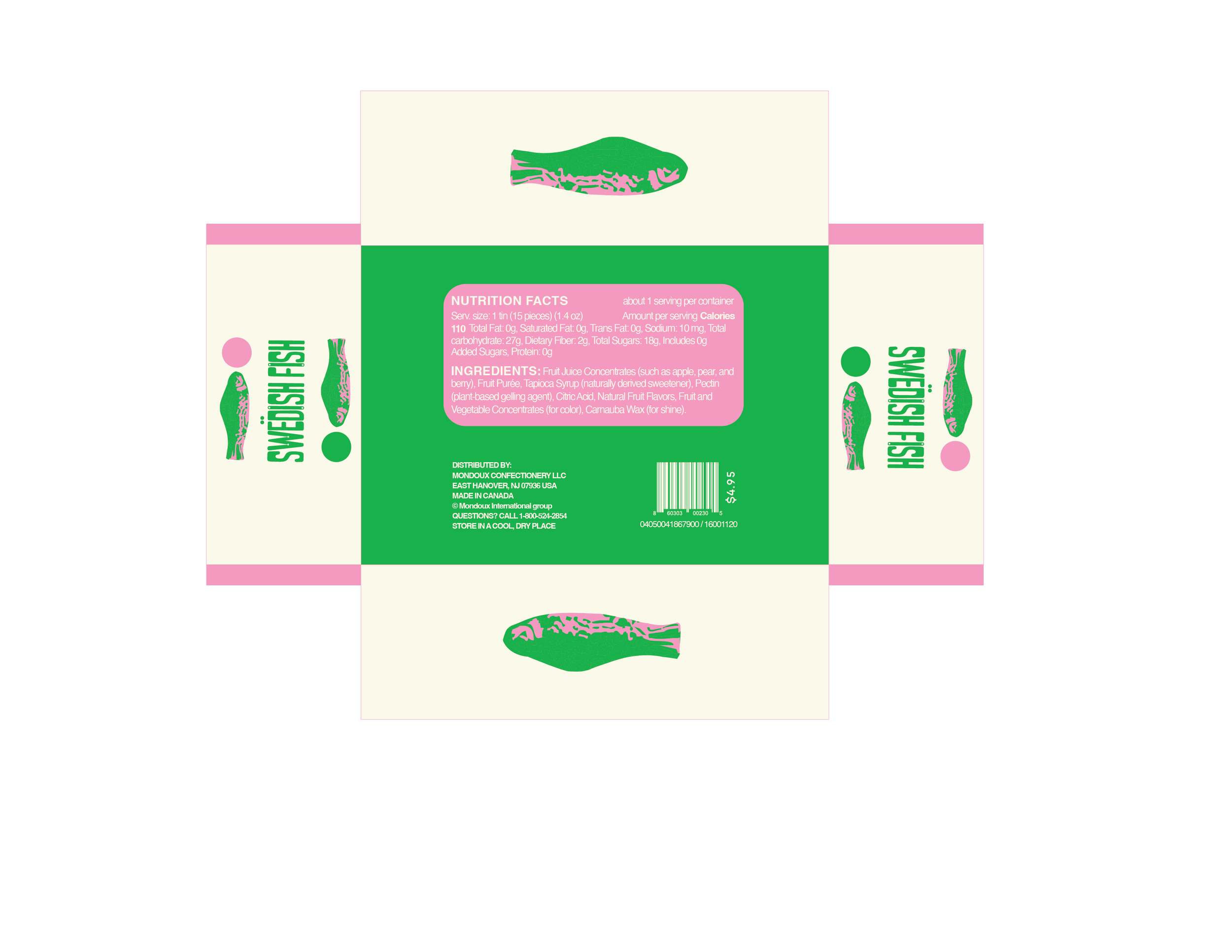
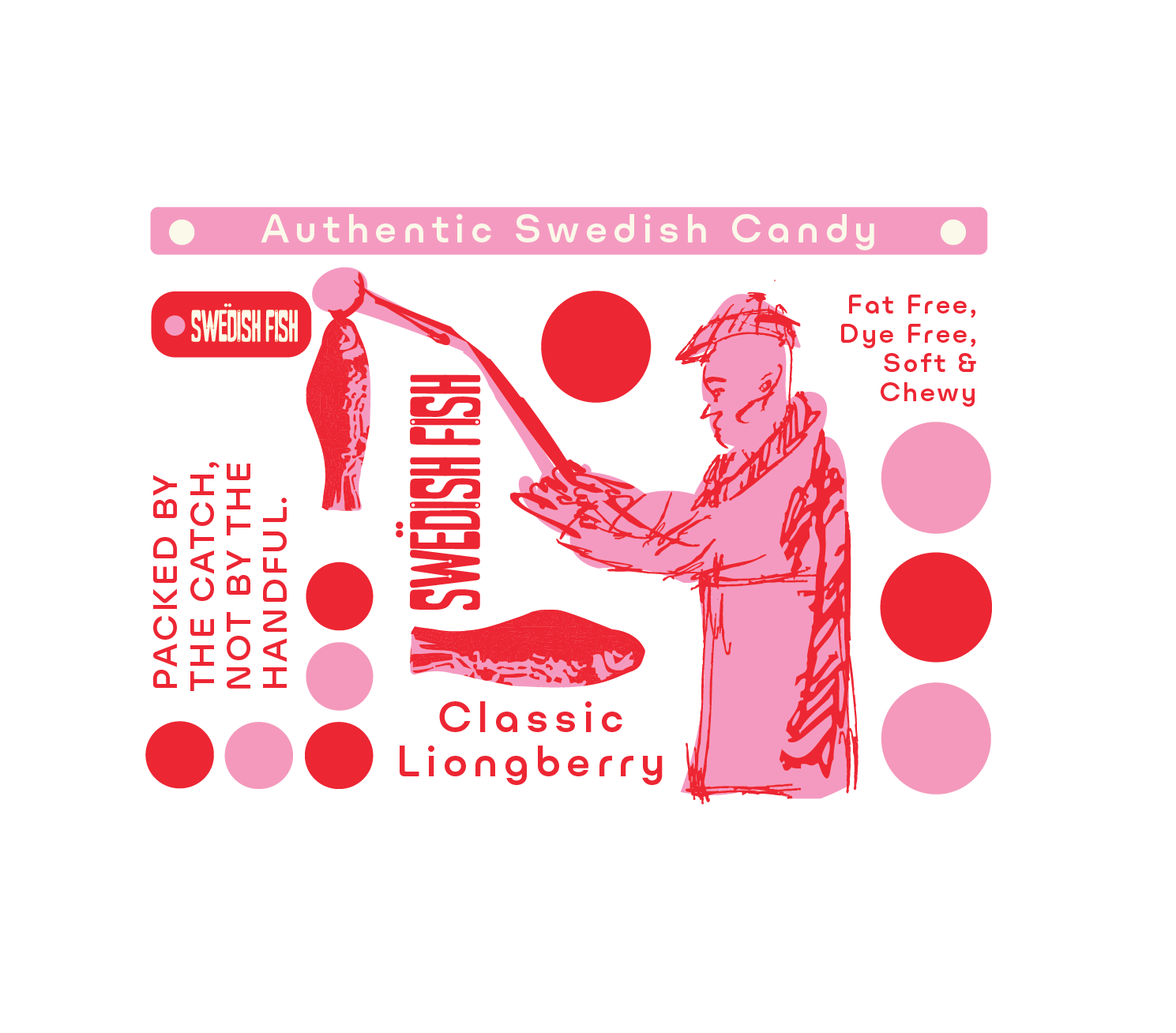
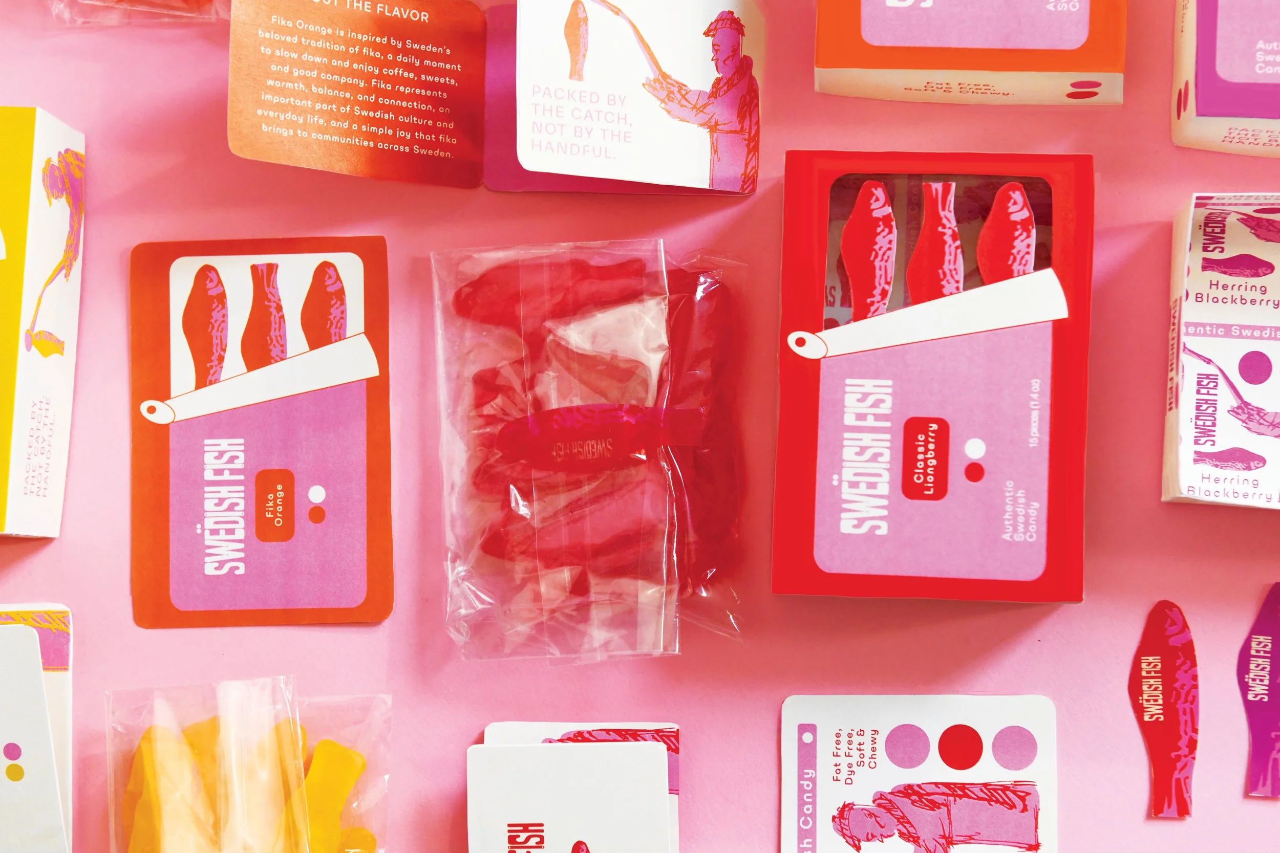
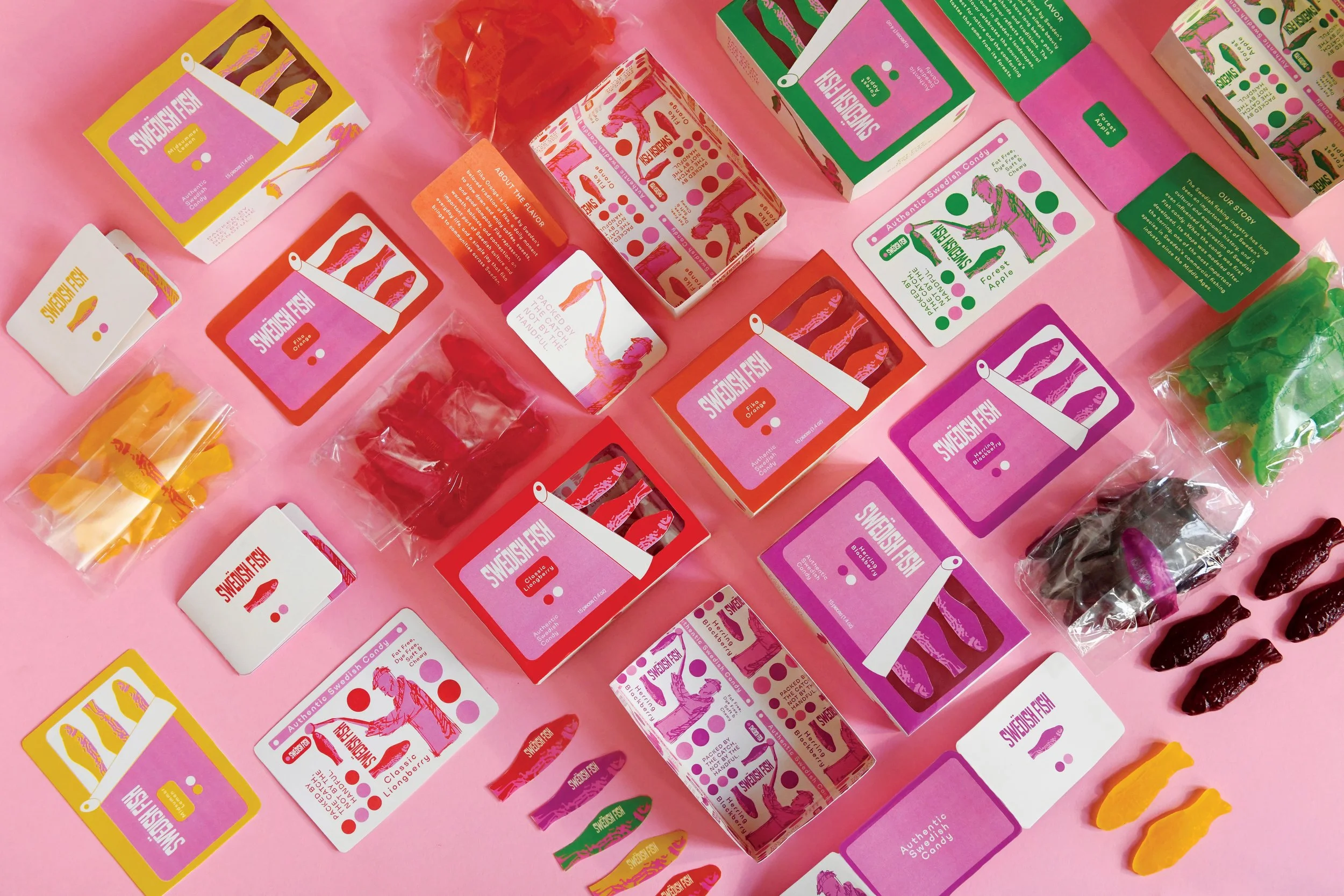
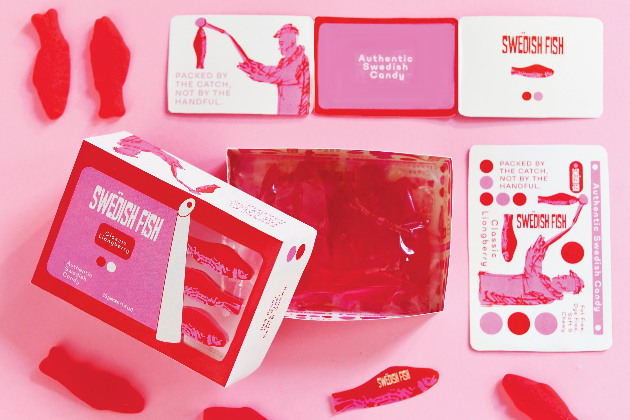
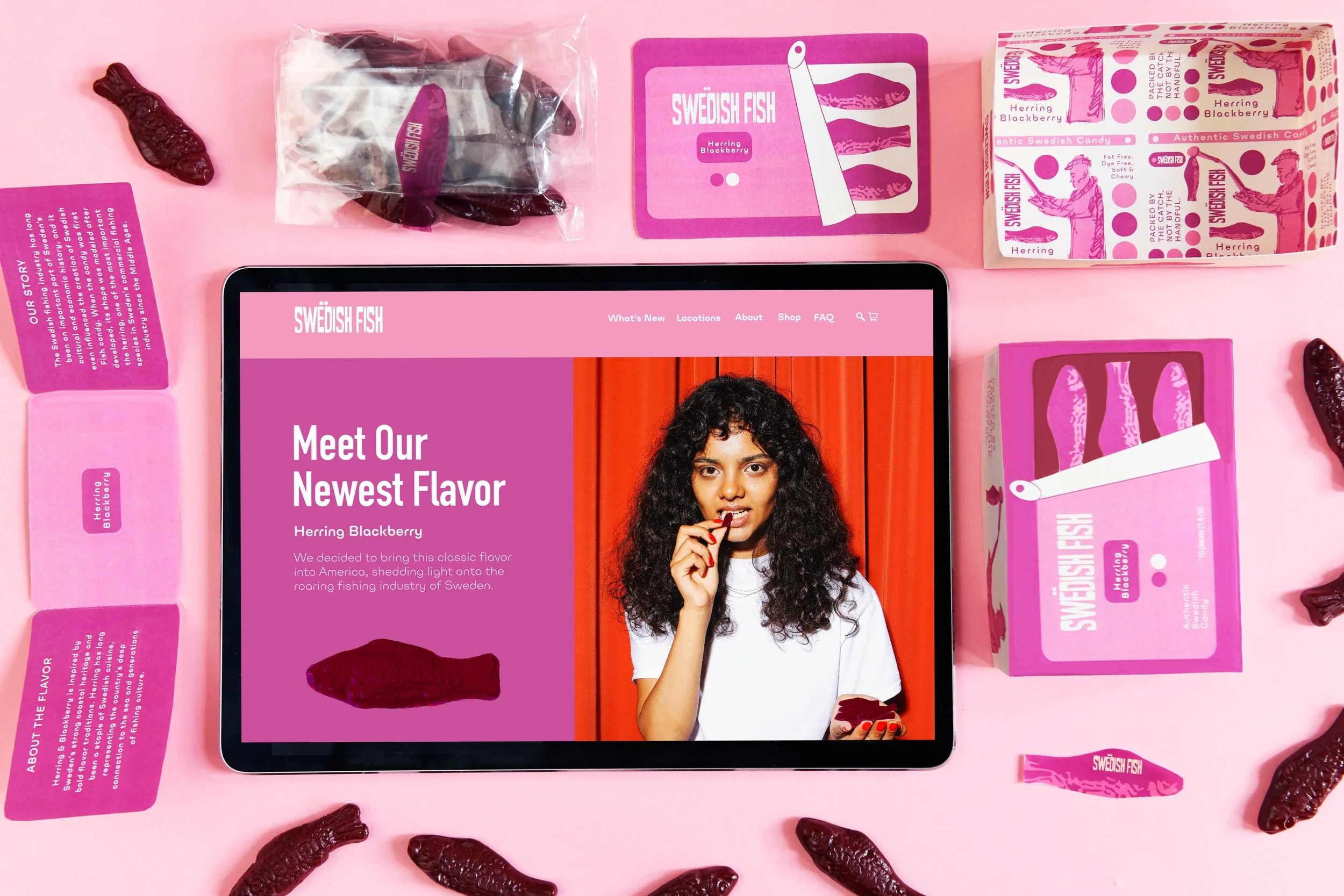
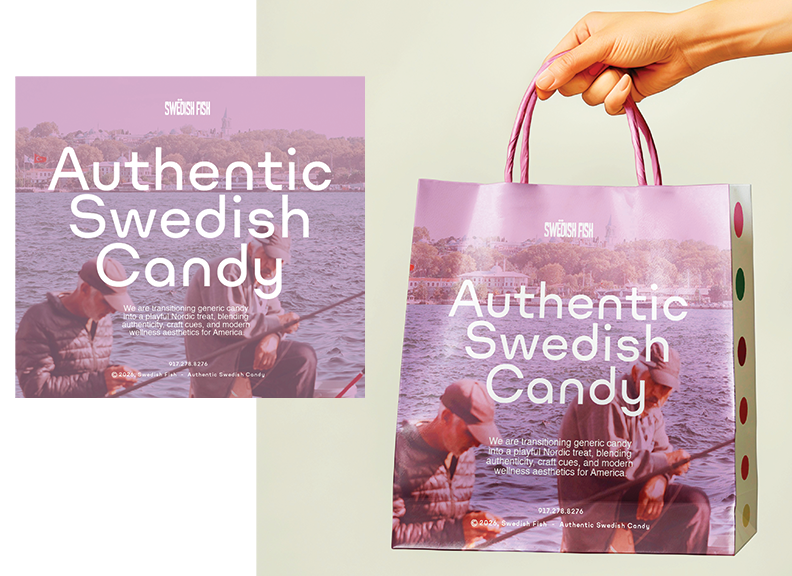
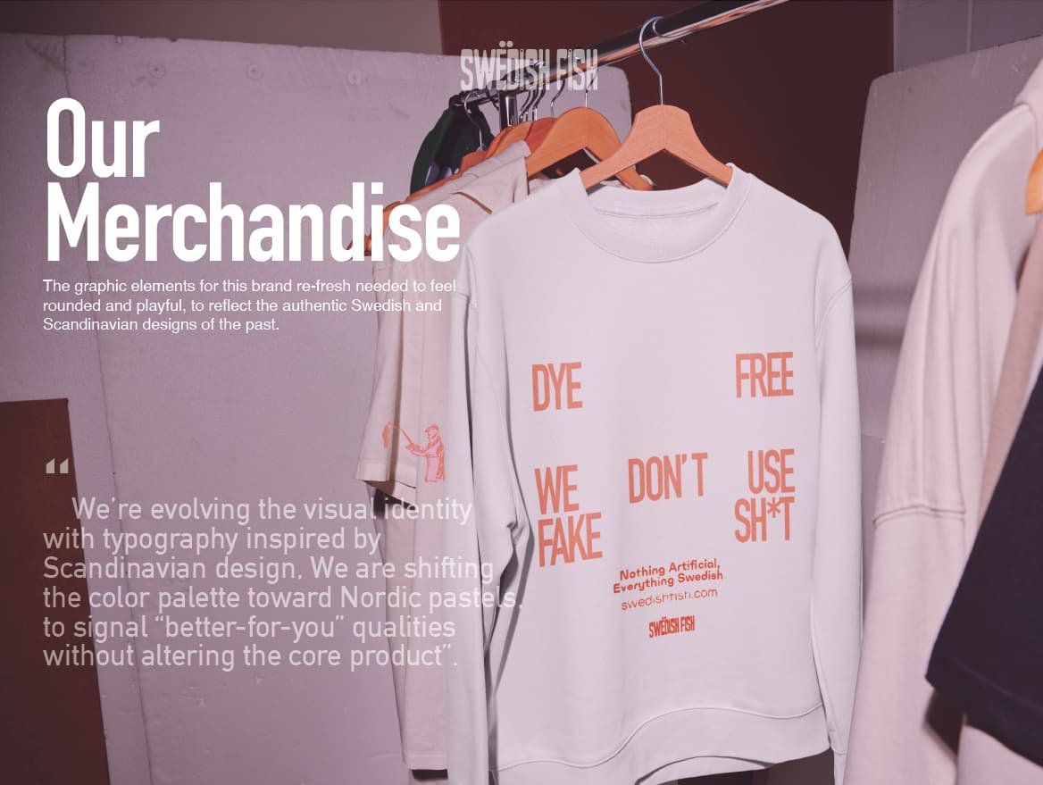
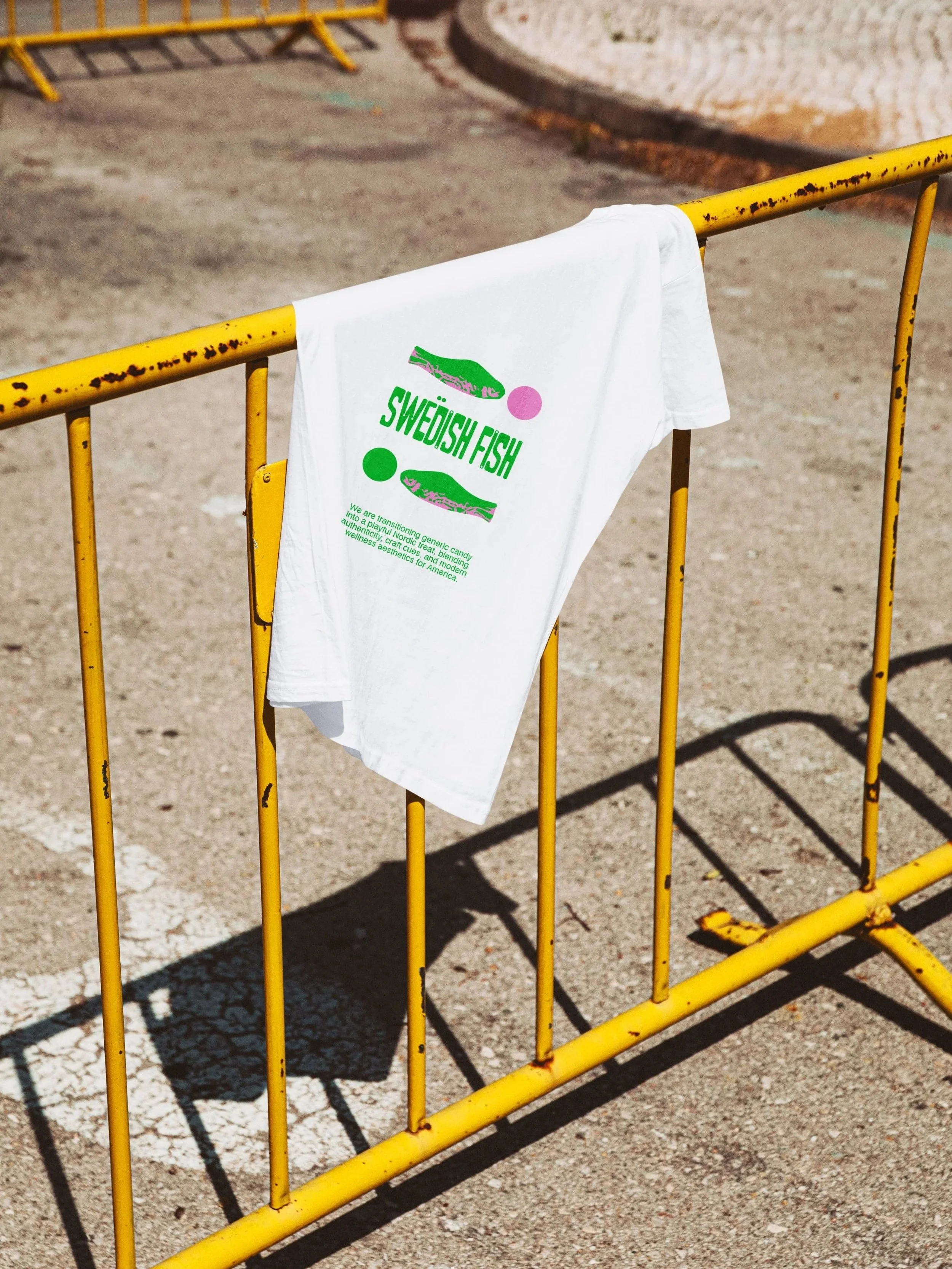
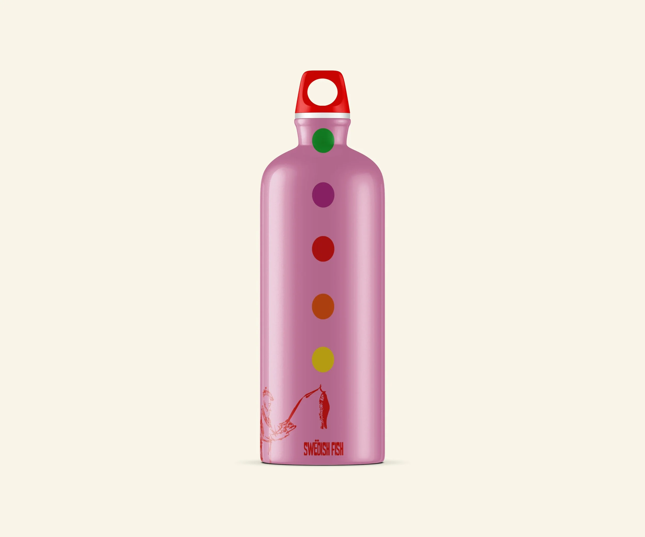
The visual identity is now evolved with rounded typography influenced by Scandinavian aesthetics and shifted the color palette toward Nordic pastels, subtly signaling a “better-for-you” quality while keeping the classic candy intact. The smaller portion sizes reflect Scandinavian moderation and nod to Sweden’s fishing industry.
This refresh turns a familiar candy into a playful Nordic treat, blending authenticity, craftsmanship cues, and modern wellness aesthetics, all while retaining the iconic fish silhouette to preserve brand recognition.
Advertisement Campaign

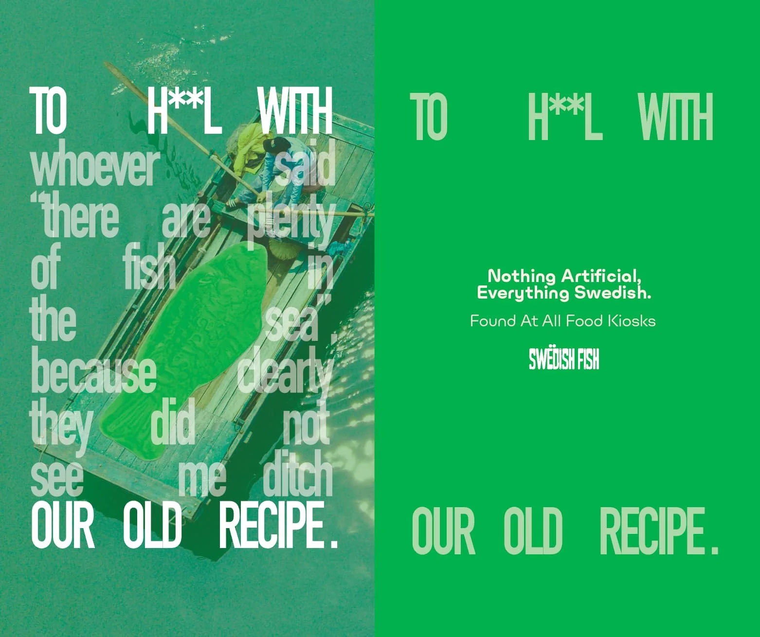
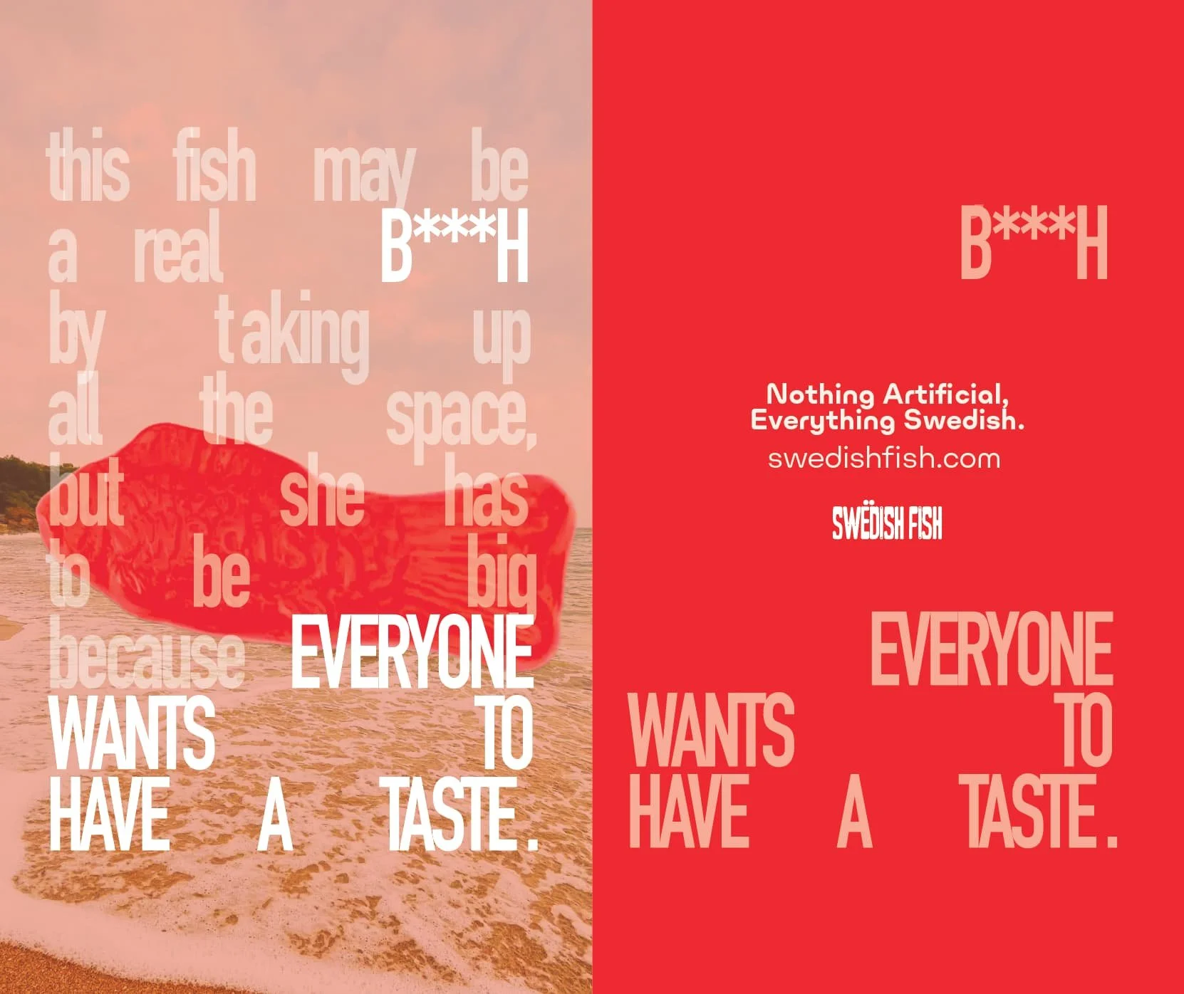
Grocery Store Advertisement
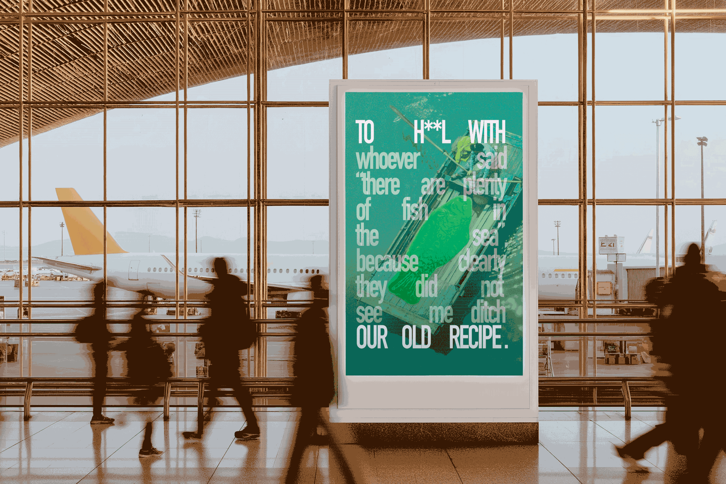
Airport Advertisement
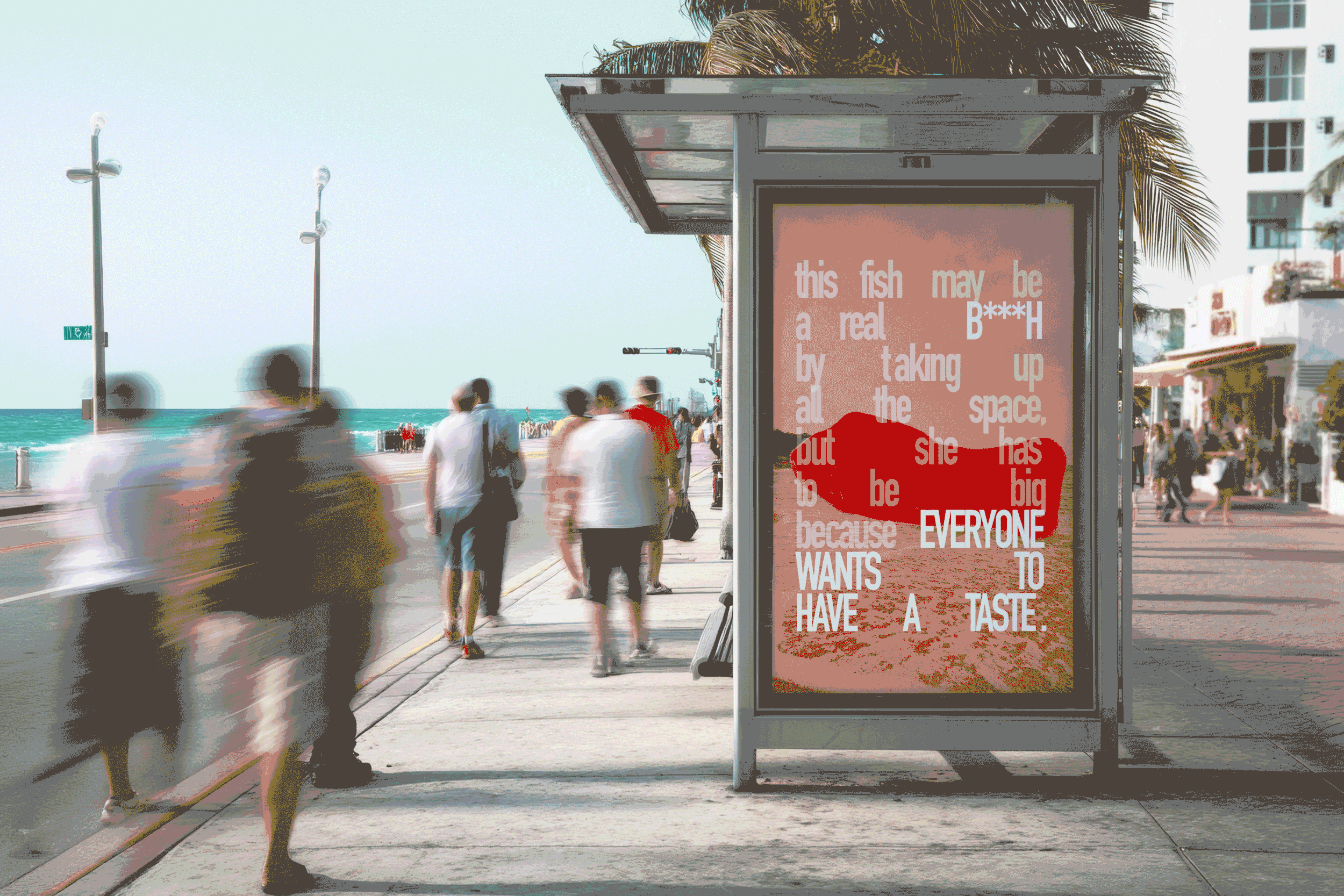
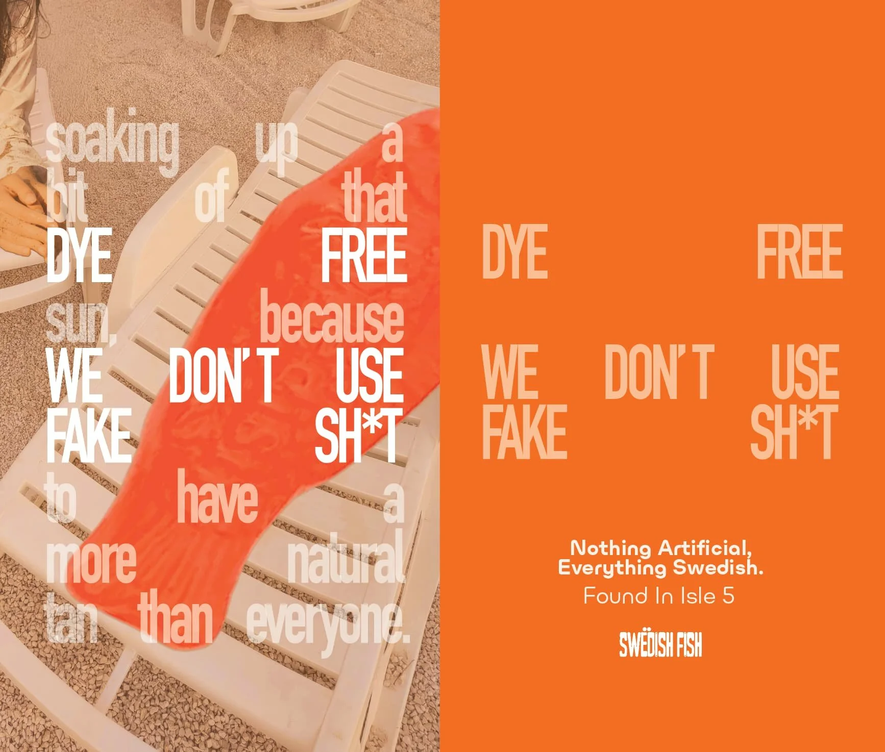
Beach Boardwalk Advertisement
-
![]()
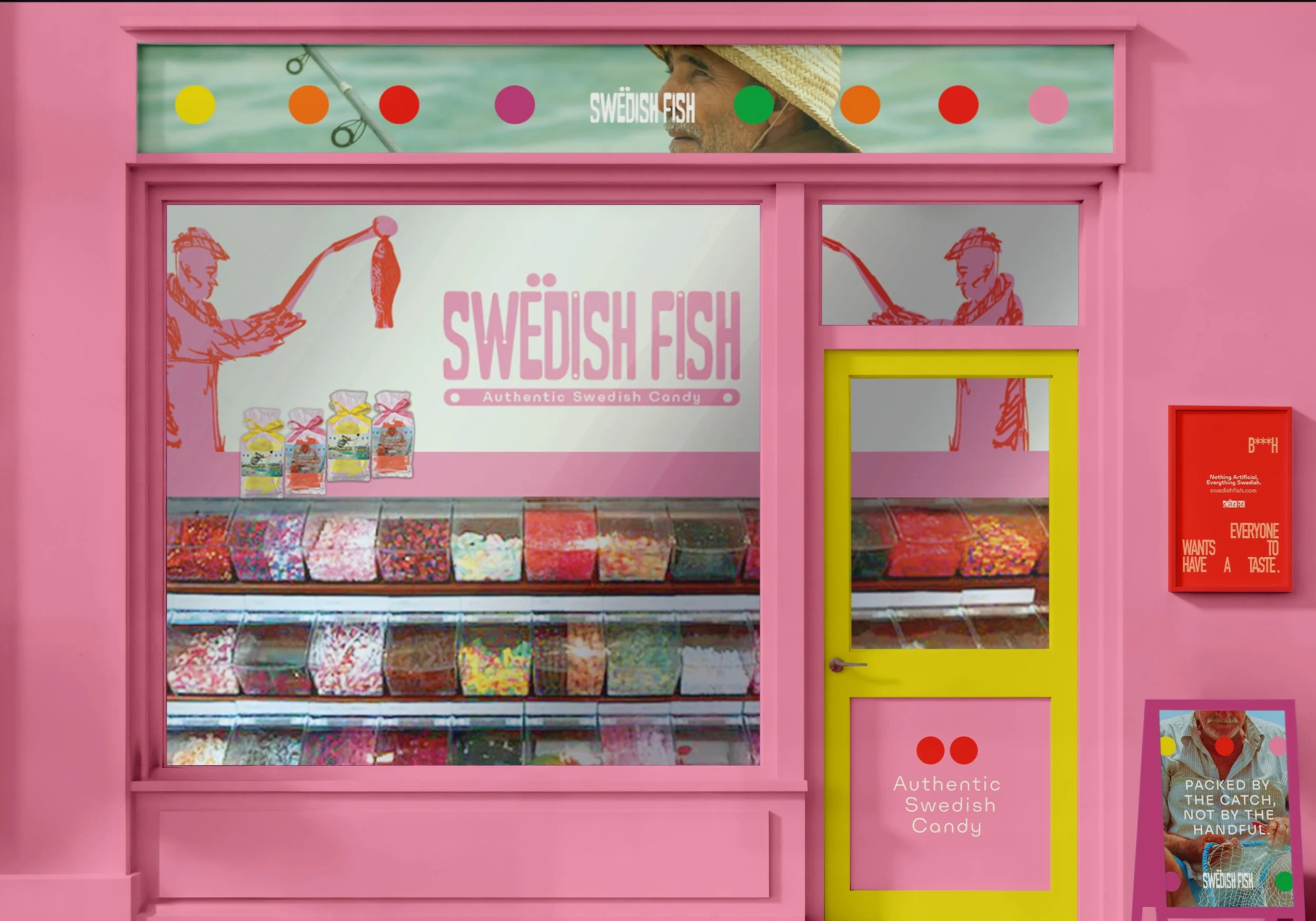
Storefront
-
![]()
New List Item
-
![]()
In Store Candy Bags
-
![]()
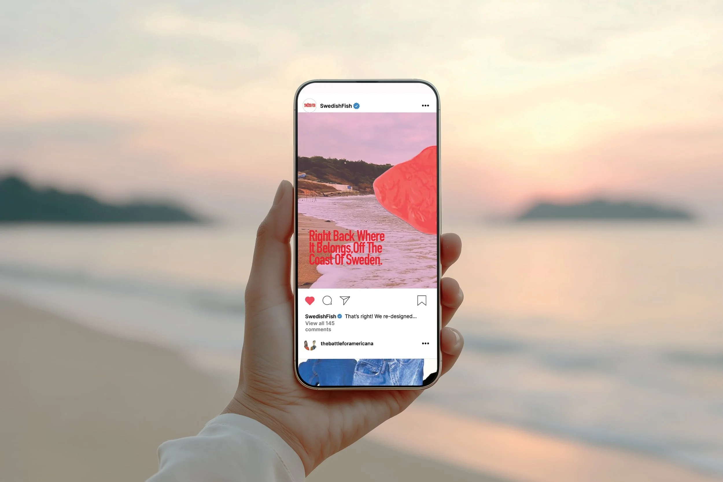
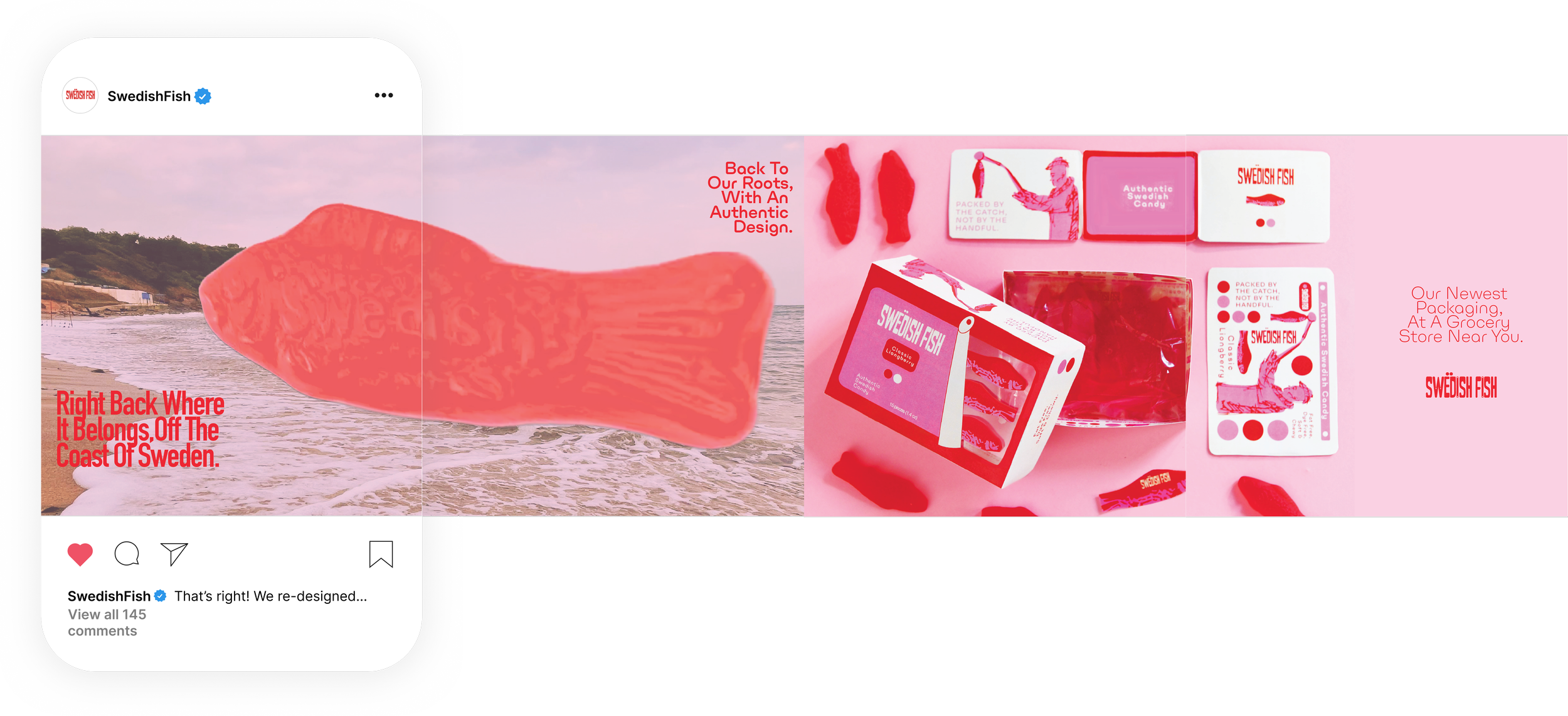
Mobile Advertisement
-
![]()
Full Mobile Advertisement
-
![]()
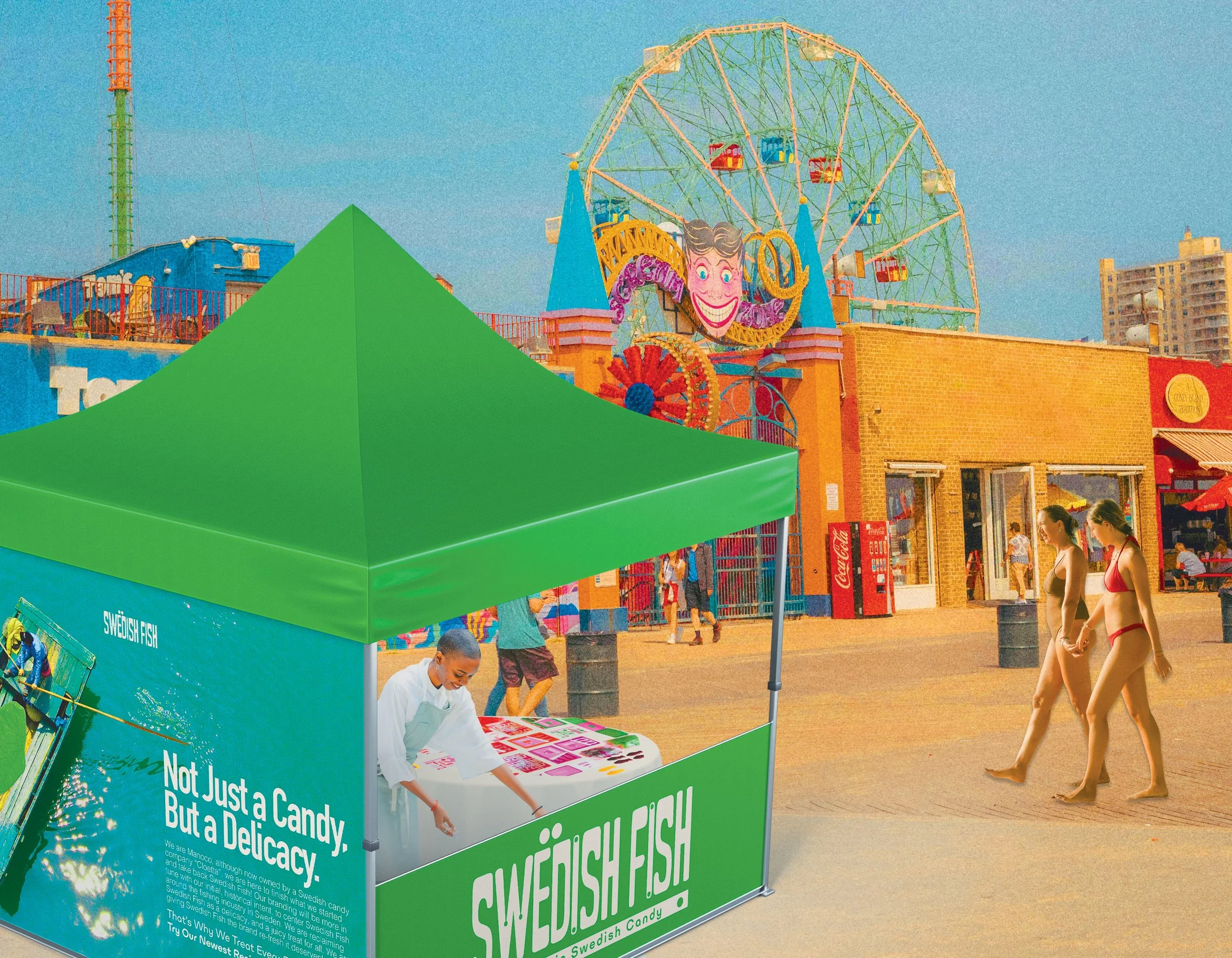
Swedish Fish Boardwalk Pop-Up
-
![]()
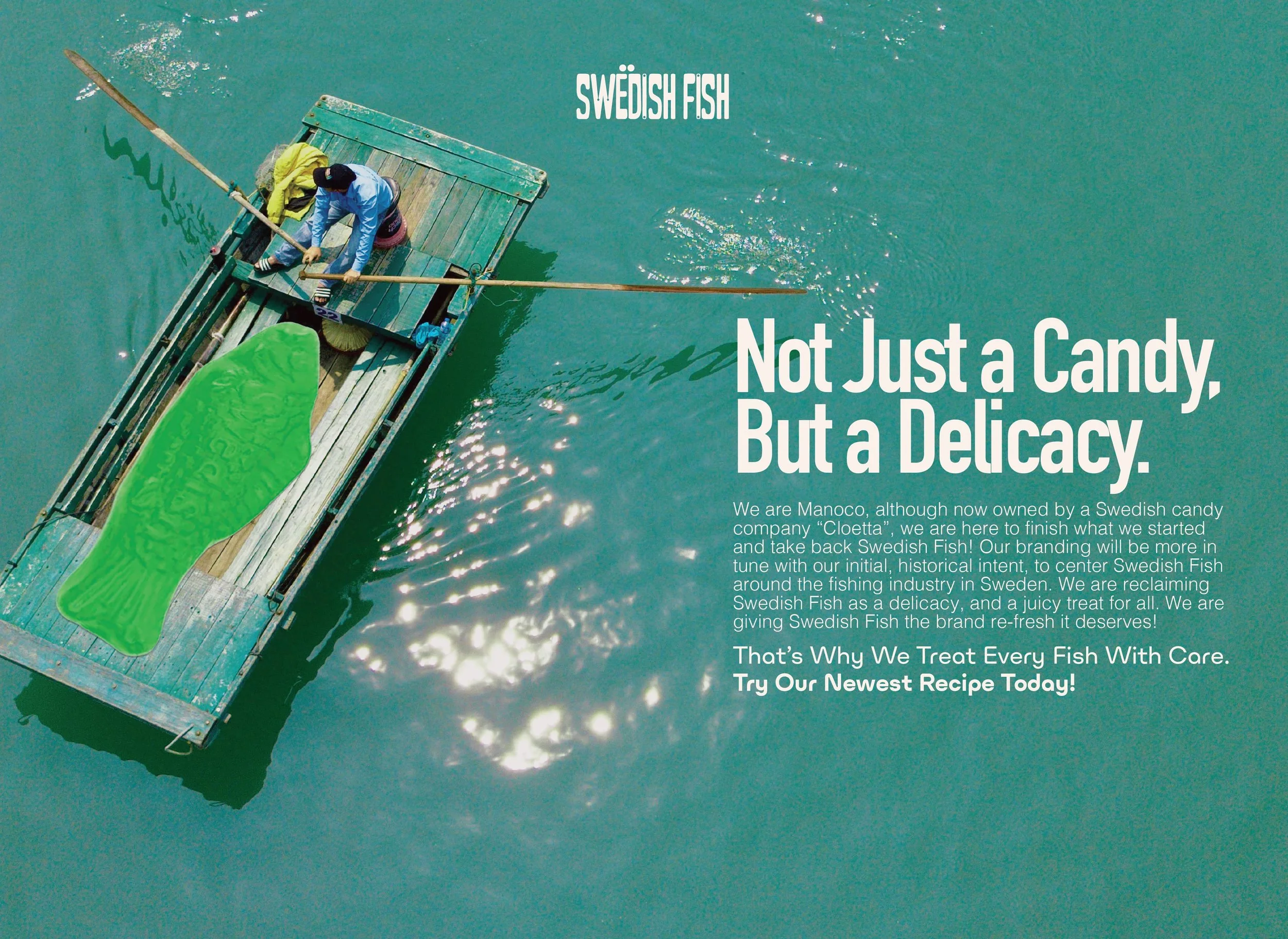
Tent Advertisement Flat
-
![]()
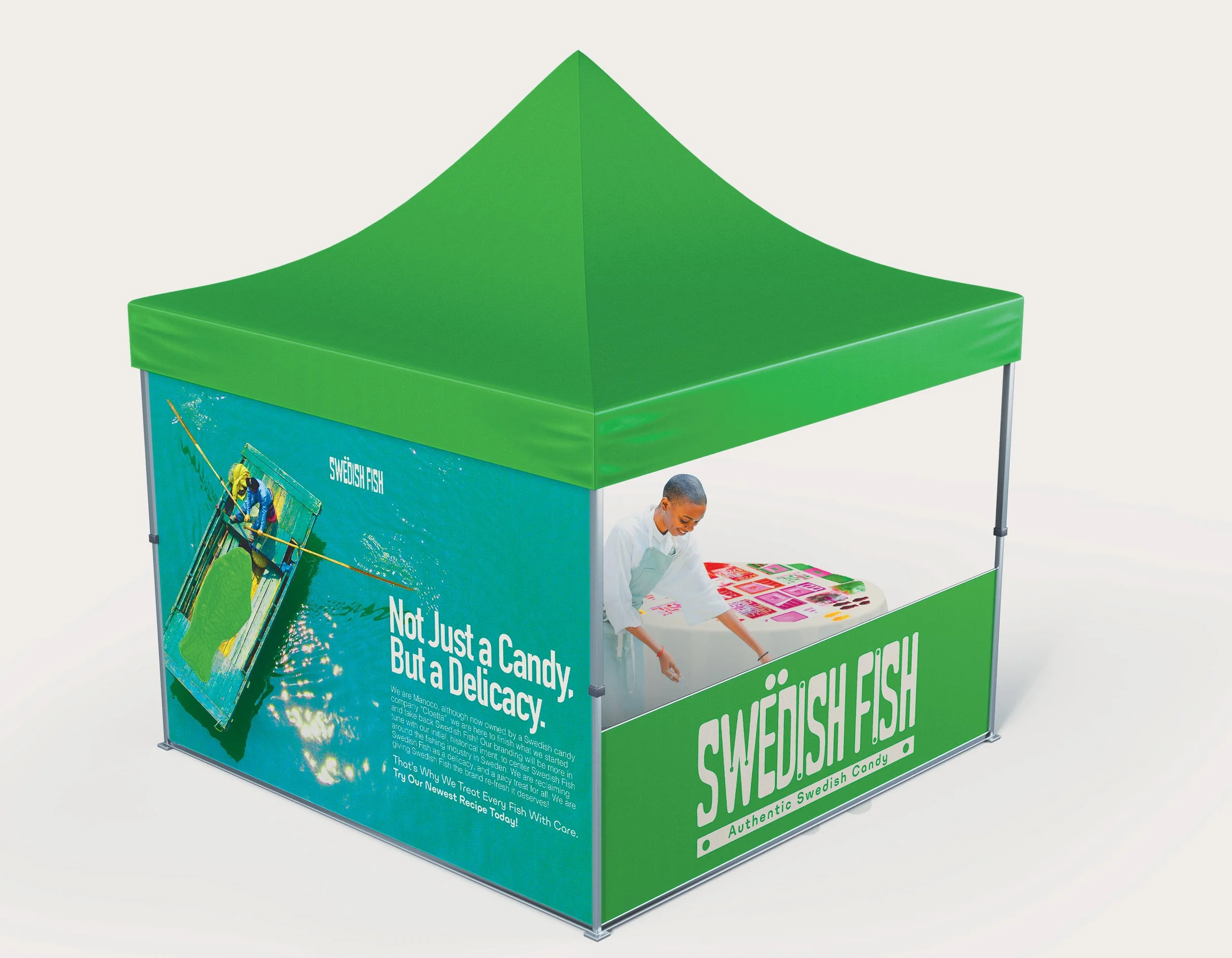
Tent for Pop-Up
-
![]()
Our Merchandise
-
![]()
T- Shirt
-
![]()
Tote Bag
-
![]()
waterbottle
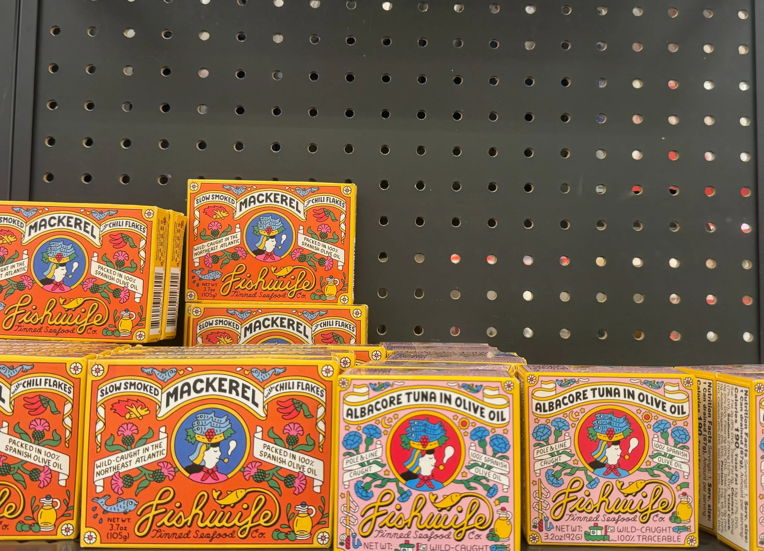
The Drawing Board
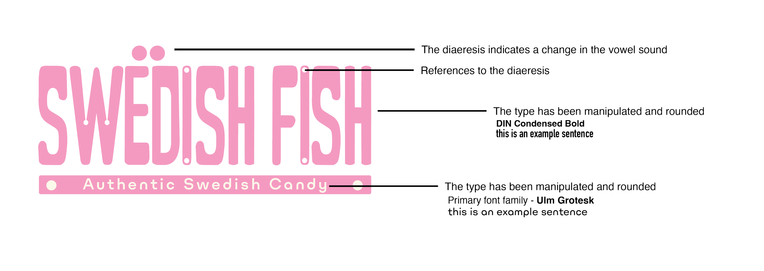
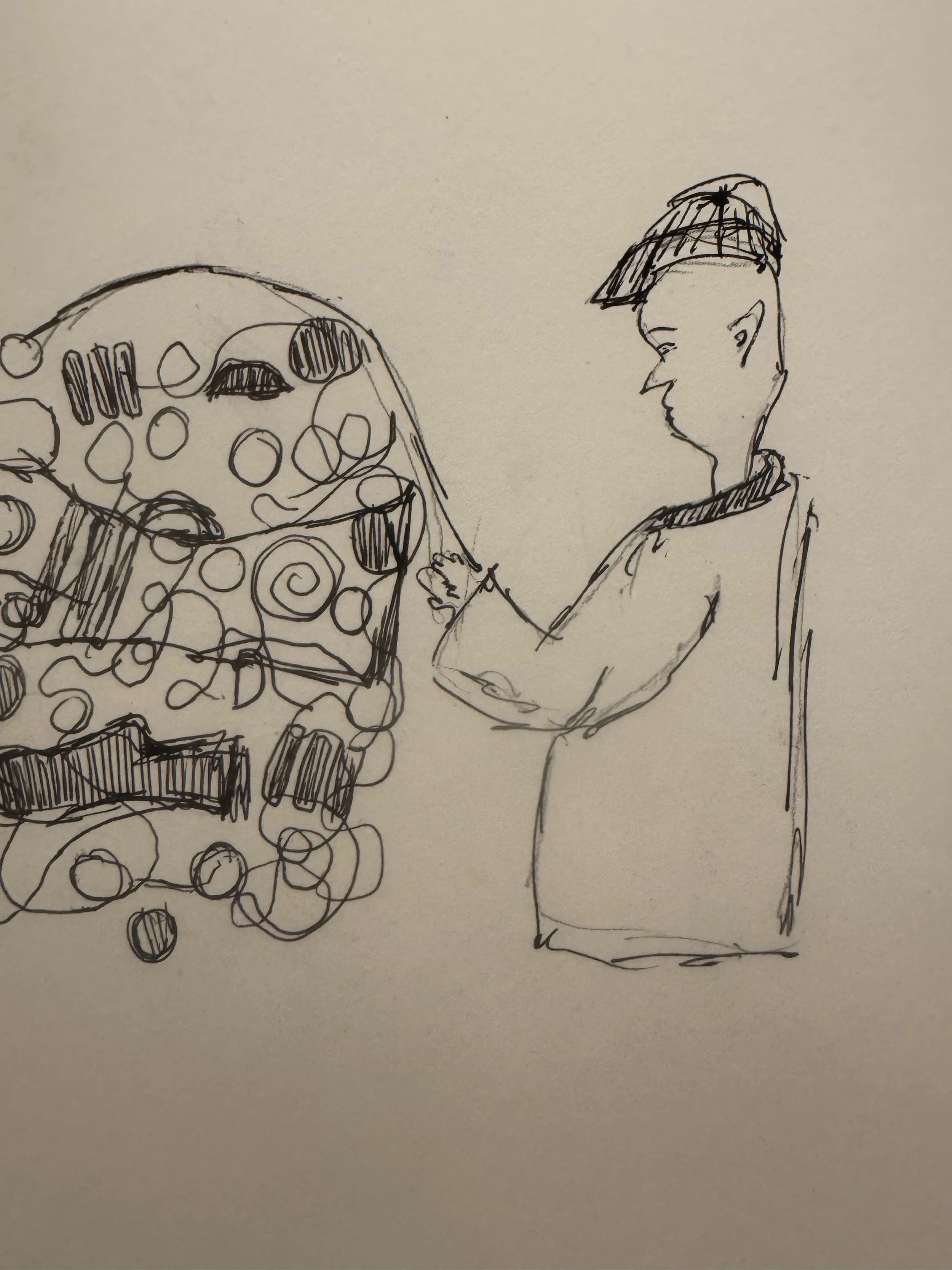
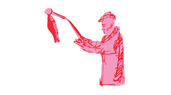
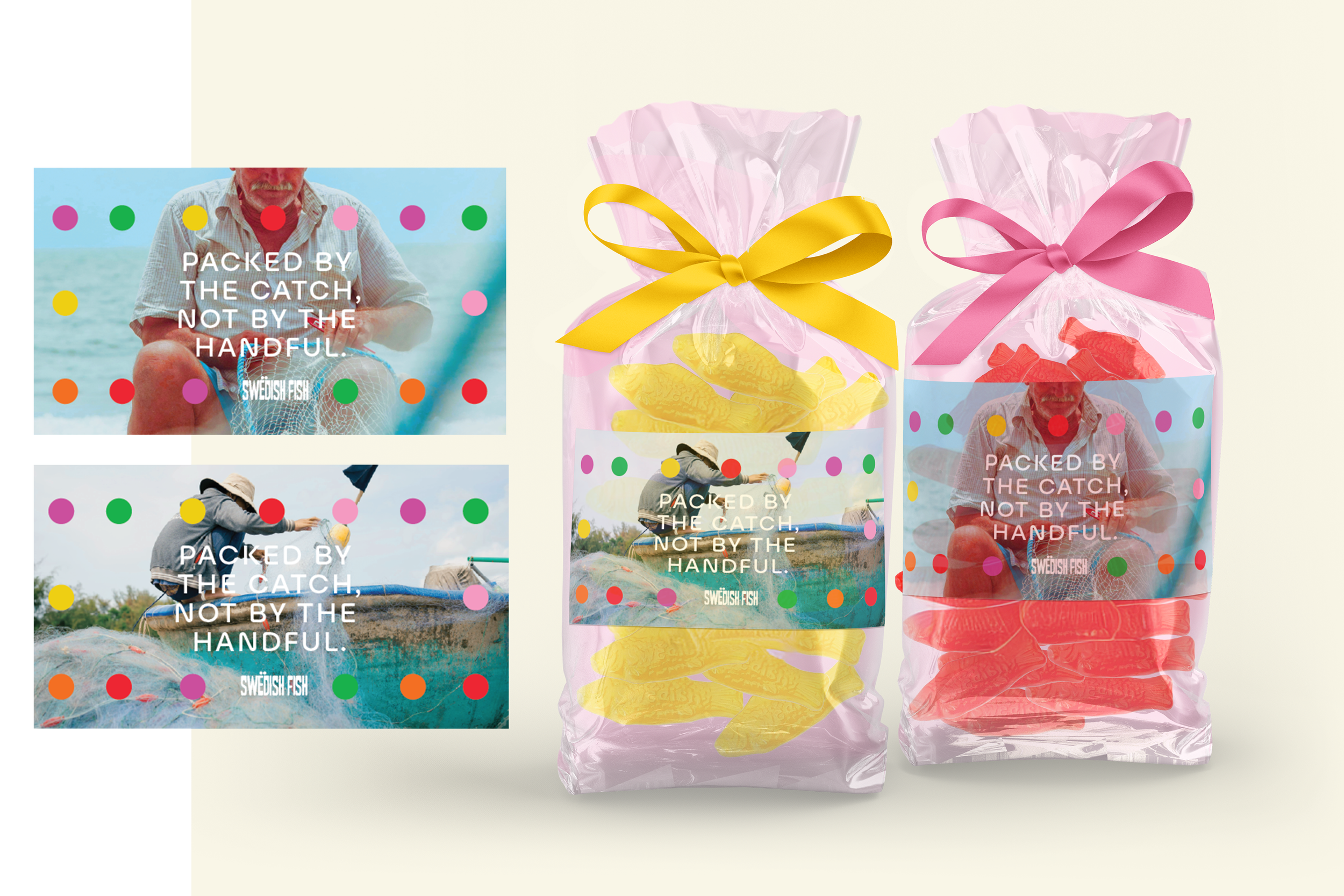
The graphic elements of the refresh are rounded and playful, echoing authentic Swedish and Scandinavian design. the diaeresis—those two small dots indicating a vowel change—are included throughout the packaging as a nod to the language and culture that inspired the candy.
-
![]()
Packaging example
-
![]()
-
![]()
pattern example
-
![]()
logo breakdown
-
![]()
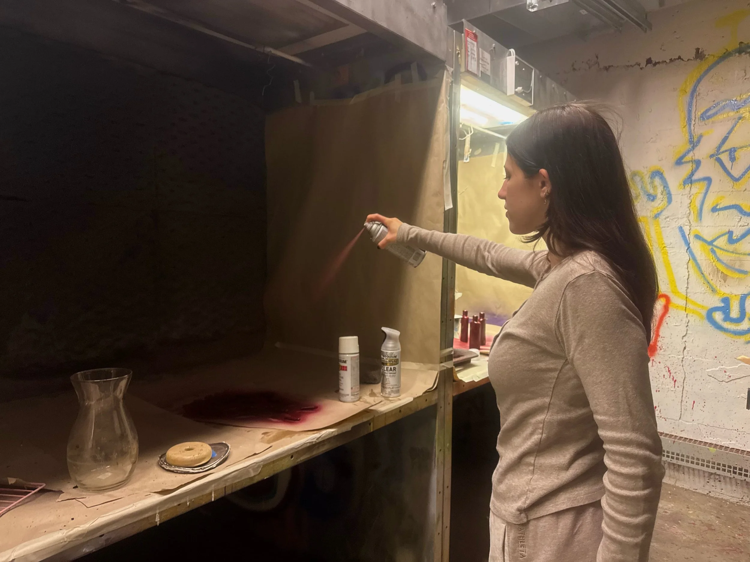
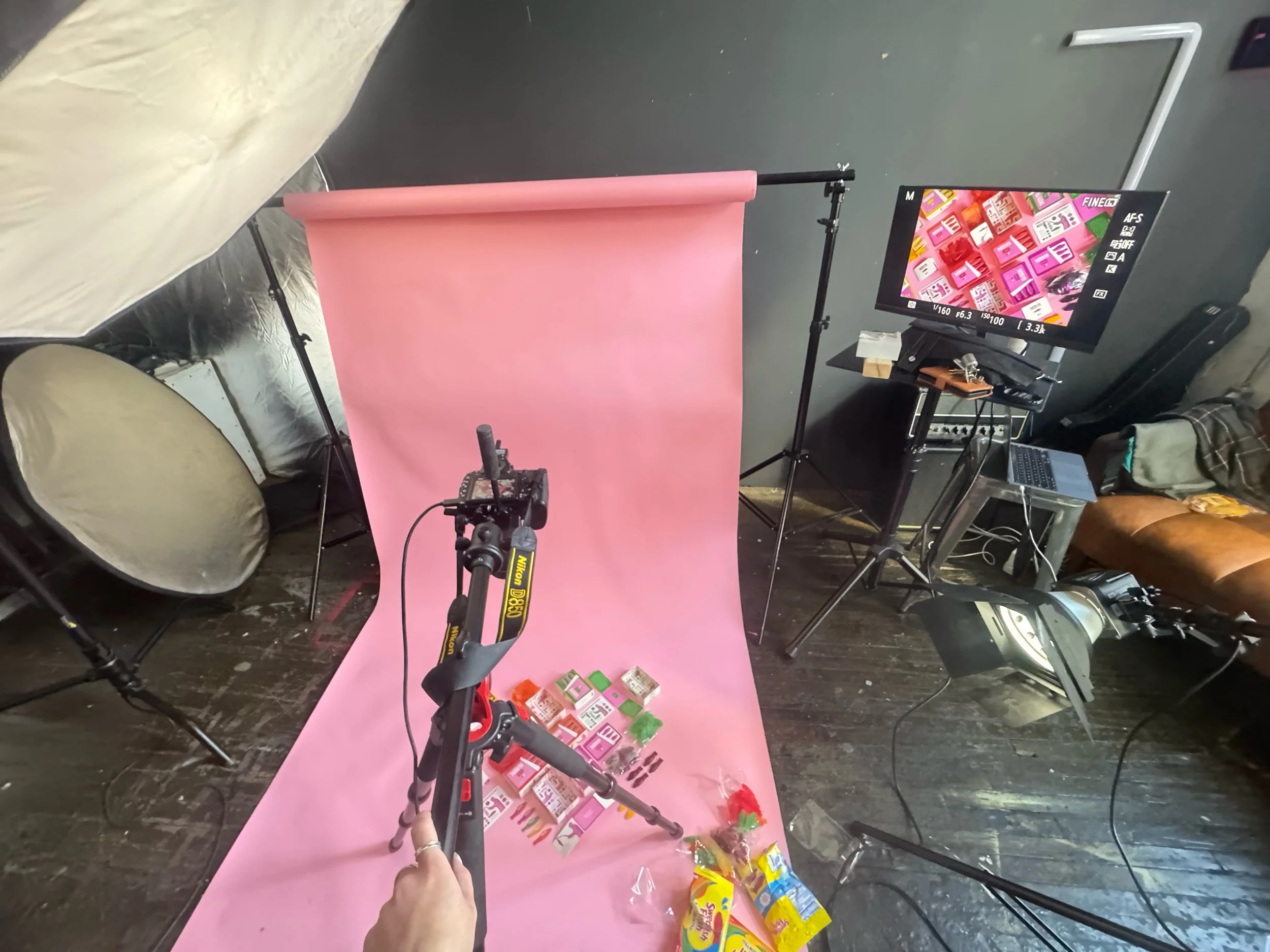
Process
-
![]()
Process
-
![]()
Process
-
![]()
Process
-
![]()
Process
-
![]()
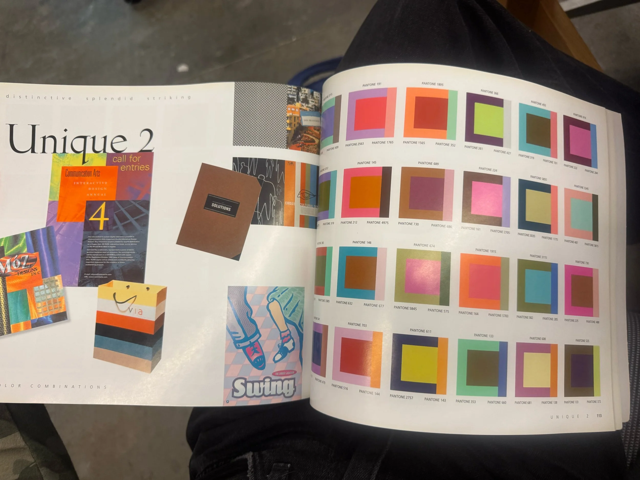
Gathering Inspiration
-
![]()
Gathering Inspiration
-
![]()
Art Direction